It is Impossible to Write Text
🅣🅔🅧🅣🅣🅔🅧🅣🅣🅔🅧🅣🅣🅔🅧🅣🅣🅔🅧🅣🅣🅔🅧🅣🅣🅔🅧🅣🅣🅔🅧🅣🅣🅔🅧🅣🅣🅔🅧🅣🅣🅔🅧🅣🅣🅔🅧🅣
🅣🅔🅧🅣🅣🅔🅧🅣🅣🅔🅧🅣🅣🅔🅧🅣🅣🅔🅧🅣🅣🅔🅧🅣🅣🅔🅧🅣🅣🅔🅧🅣🅣🅔🅧🅣🅣🅔🅧🅣🅣🅔🅧🅣🅣🅔🅧🅣
🅣🅔ⓍⓉⓉⒺⓍⓉⓉⒺ🅧🅣🅣ⒺⓍⓉⓉⒺⓍ🅣🅣🅔🅧🅣🅣🅔ⓍⓉ🅣🅔🅧🅣ⓉⒺ🅧🅣🅣🅔ⓍⓉⓉⒺⓍⓉⓉⒺ🅧🅣
🅣🅔🅧🅣🅣ⒺⓍ🅣🅣🅔🅧🅣🅣ⒺⓍ🅣🅣🅔🅧🅣🅣🅔🅧🅣🅣🅔🅧ⓉⓉ🅔🅧ⓉⓉ🅔🅧🅣🅣🅔🅧🅣🅣ⒺⓍ🅣🅣🅔🅧🅣
🅣🅔🅧🅣🅣ⒺⓍ🅣🅣🅔🅧🅣🅣ⒺⓍ🅣🅣🅔🅧🅣🅣🅔🅧🅣🅣🅔🅧🅣ⓉⒺⓍⓉ🅣🅔🅧🅣🅣🅔🅧🅣🅣ⒺⓍ🅣🅣🅔🅧🅣
🅣🅔🅧🅣🅣ⒺⓍ🅣🅣🅔🅧🅣🅣ⒺⓍⓉⓉⒺⓍ🅣🅣🅔🅧🅣🅣🅔🅧🅣🅣ⒺⓍ🅣🅣🅔🅧🅣🅣🅔🅧🅣🅣ⒺⓍ🅣🅣🅔🅧🅣
🅣🅔🅧🅣🅣ⒺⓍ🅣🅣🅔🅧🅣🅣ⒺⓍ🅣🅣🅔🅧🅣🅣🅔🅧🅣🅣🅔🅧🅣ⓉⒺⓍⓉ🅣🅔🅧🅣🅣🅔🅧🅣🅣ⒺⓍ🅣🅣🅔🅧🅣
🅣🅔🅧🅣🅣ⒺⓍ🅣🅣🅔🅧🅣🅣ⒺⓍ🅣🅣🅔🅧🅣🅣🅔🅧🅣🅣🅔🅧ⓉⓉ🅔🅧ⓉⓉ🅔🅧🅣🅣🅔🅧🅣🅣ⒺⓍ🅣🅣🅔🅧🅣
🅣🅔🅧🅣🅣ⒺⓍ🅣🅣🅔🅧🅣🅣ⒺⓍⓉⓉⒺⓍ🅣🅣🅔🅧🅣🅣🅔ⓍⓉ🅣🅔🅧🅣ⓉⒺ🅧🅣🅣🅔🅧🅣🅣ⒺⓍ🅣🅣🅔🅧🅣
🅣🅔🅧🅣🅣🅔🅧🅣🅣🅔🅧🅣🅣🅔🅧🅣🅣🅔🅧🅣🅣🅔🅧🅣🅣🅔🅧🅣🅣🅔🅧🅣🅣🅔🅧🅣🅣🅔🅧🅣🅣🅔🅧🅣🅣🅔🅧🅣
🅣🅔🅧🅣🅣🅔🅧🅣🅣🅔🅧🅣🅣🅔🅧🅣🅣🅔🅧🅣🅣🅔🅧🅣🅣🅔🅧🅣🅣🅔🅧🅣🅣🅔🅧🅣🅣🅔🅧🅣🅣🅔🅧🅣🅣🅔🅧🅣
ⓉⒺⓍⓉⓉⒺⓍⓉⓉⒺⓍⓉⓉⒺⓍⓉⓉⒺⓍⓉⓉⒺⓍⓉⓉⒺⓍⓉⓉⒺⓍⓉⓉⒺⓍⓉⓉⒺⓍⓉⓉⒺⓍⓉⓉⒺⓍⓉ
ⓉⒺⓍⓉⓉⒺⓍⓉⓉⒺⓍⓉⓉⒺⓍⓉⓉⒺⓍⓉⓉⒺⓍⓉⓉⒺⓍⓉⓉⒺⓍⓉⓉⒺⓍⓉⓉⒺⓍⓉⓉⒺⓍⓉⓉⒺⓍⓉ
ⓉⒺ🅧🅣🅣🅔🅧🅣🅣🅔ⓍⓉⓉ🅔🅧🅣🅣🅔🅧ⓉⓉⒺⓍⓉⓉⒺ🅧🅣ⓉⒺⓍⓉ🅣🅔ⓍⓉⓉⒺ🅧🅣🅣🅔🅧🅣🅣🅔ⓍⓉ
ⓉⒺⓍⓉⓉ🅔🅧ⓉⓉⒺⓍⓉⓉ🅔🅧ⓉⓉⒺⓍⓉⓉⒺⓍⓉⓉⒺⓍ🅣🅣ⒺⓍ🅣🅣ⒺⓍⓉⓉⒺⓍⓉⓉ🅔🅧ⓉⓉⒺⓍⓉ
ⓉⒺⓍⓉⓉ🅔🅧ⓉⓉⒺⓍⓉⓉ🅔🅧ⓉⓉⒺⓍⓉⓉⒺⓍⓉⓉⒺⓍⓉ🅣🅔🅧🅣ⓉⒺⓍⓉⓉⒺⓍⓉⓉ🅔🅧ⓉⓉⒺⓍⓉ
ⓉⒺⓍⓉⓉ🅔🅧ⓉⓉⒺⓍⓉⓉ🅔🅧🅣🅣🅔🅧ⓉⓉⒺⓍⓉⓉⒺⓍⓉⓉ🅔🅧ⓉⓉⒺⓍⓉⓉⒺⓍⓉⓉ🅔🅧ⓉⓉⒺⓍⓉ
ⓉⒺⓍⓉⓉ🅔🅧ⓉⓉⒺⓍⓉⓉ🅔🅧ⓉⓉⒺⓍⓉⓉⒺⓍⓉⓉⒺⓍⓉ🅣🅔🅧🅣ⓉⒺⓍⓉⓉⒺⓍⓉⓉ🅔🅧ⓉⓉⒺⓍⓉ
ⓉⒺⓍⓉⓉ🅔🅧ⓉⓉⒺⓍⓉⓉ🅔🅧ⓉⓉⒺⓍⓉⓉⒺⓍⓉⓉⒺⓍ🅣🅣ⒺⓍ🅣🅣ⒺⓍⓉⓉⒺⓍⓉⓉ🅔🅧ⓉⓉⒺⓍⓉ
ⓉⒺⓍⓉⓉ🅔🅧ⓉⓉⒺⓍⓉⓉ🅔🅧🅣🅣🅔🅧ⓉⓉⒺⓍⓉⓉⒺ🅧🅣ⓉⒺⓍⓉ🅣🅔ⓍⓉⓉⒺⓍⓉⓉ🅔🅧ⓉⓉⒺⓍⓉ
ⓉⒺⓍⓉⓉⒺⓍⓉⓉⒺⓍⓉⓉⒺⓍⓉⓉⒺⓍⓉⓉⒺⓍⓉⓉⒺⓍⓉⓉⒺⓍⓉⓉⒺⓍⓉⓉⒺⓍⓉⓉⒺⓍⓉⓉⒺⓍⓉ
ⓉⒺⓍⓉⓉⒺⓍⓉⓉⒺⓍⓉⓉⒺⓍⓉⓉⒺⓍⓉⓉⒺⓍⓉⓉⒺⓍⓉⓉⒺⓍⓉⓉⒺⓍⓉⓉⒺⓍⓉⓉⒺⓍⓉⓉⒺⓍⓉ
🅣🅔🅧🅣🅣🅔🅧🅣🅣🅔🅧🅣🅣🅔🅧🅣🅣🅔🅧🅣🅣🅔🅧🅣🅣🅔🅧🅣🅣🅔🅧🅣🅣🅔🅧🅣🅣🅔🅧🅣🅣🅔🅧🅣🅣🅔🅧🅣
🅣🅔🅧🅣🅣🅔🅧🅣🅣🅔🅧🅣🅣🅔🅧🅣🅣🅔🅧🅣🅣🅔🅧🅣🅣🅔🅧🅣🅣🅔🅧🅣🅣🅔🅧🅣🅣🅔🅧🅣🅣🅔🅧🅣🅣🅔🅧🅣
🅣🅔ⓍⓉⓉⒺⓍⓉⓉⒺ🅧🅣🅣ⒺⓍⓉⓉⒺⓍ🅣🅣🅔🅧🅣🅣🅔ⓍⓉ🅣🅔🅧🅣ⓉⒺ🅧🅣🅣🅔ⓍⓉⓉⒺⓍⓉⓉⒺ🅧🅣
🅣🅔🅧🅣🅣ⒺⓍ🅣🅣🅔🅧🅣🅣ⒺⓍ🅣🅣🅔🅧🅣🅣🅔🅧🅣🅣🅔🅧ⓉⓉ🅔🅧ⓉⓉ🅔🅧🅣🅣🅔🅧🅣🅣ⒺⓍ🅣🅣🅔🅧🅣
🅣🅔🅧🅣🅣ⒺⓍ🅣🅣🅔🅧🅣🅣ⒺⓍ🅣🅣🅔🅧🅣🅣🅔🅧🅣🅣🅔🅧🅣ⓉⒺⓍⓉ🅣🅔🅧🅣🅣🅔🅧🅣🅣ⒺⓍ🅣🅣🅔🅧🅣
🅣🅔🅧🅣🅣ⒺⓍ🅣🅣🅔🅧🅣🅣ⒺⓍⓉⓉⒺⓍ🅣🅣🅔🅧🅣🅣🅔🅧🅣🅣ⒺⓍ🅣🅣🅔🅧🅣🅣🅔🅧🅣🅣ⒺⓍ🅣🅣🅔🅧🅣
🅣🅔🅧🅣🅣ⒺⓍ🅣🅣🅔🅧🅣🅣ⒺⓍ🅣🅣🅔🅧🅣🅣🅔🅧🅣🅣🅔🅧🅣ⓉⒺⓍⓉ🅣🅔🅧🅣🅣🅔🅧🅣🅣ⒺⓍ🅣🅣🅔🅧🅣
🅣🅔🅧🅣🅣ⒺⓍ🅣🅣🅔🅧🅣🅣ⒺⓍ🅣🅣🅔🅧🅣🅣🅔🅧🅣🅣🅔🅧ⓉⓉ🅔🅧ⓉⓉ🅔🅧🅣🅣🅔🅧🅣🅣ⒺⓍ🅣🅣🅔🅧🅣
🅣🅔🅧🅣🅣ⒺⓍ🅣🅣🅔🅧🅣🅣ⒺⓍⓉⓉⒺⓍ🅣🅣🅔🅧🅣🅣🅔ⓍⓉ🅣🅔🅧🅣ⓉⒺ🅧🅣🅣🅔🅧🅣🅣ⒺⓍ🅣🅣🅔🅧🅣
🅣🅔🅧🅣🅣🅔🅧🅣🅣🅔🅧🅣🅣🅔🅧🅣🅣🅔🅧🅣🅣🅔🅧🅣🅣🅔🅧🅣🅣🅔🅧🅣🅣🅔🅧🅣🅣🅔🅧🅣🅣🅔🅧🅣🅣🅔🅧🅣
🅣🅔🅧🅣🅣🅔🅧🅣🅣🅔🅧🅣🅣🅔🅧🅣🅣🅔🅧🅣🅣🅔🅧🅣🅣🅔🅧🅣🅣🅔🅧🅣🅣🅔🅧🅣🅣🅔🅧🅣🅣🅔🅧🅣🅣🅔🅧🅣
It’s common to describe written works as using ‘text’ - a technology that transparently transmits the content of language into the mind of the reader. In this imagining of writing different copies of a written work are interchangeable. They all have the same content and so reading on is the same as reading another. The arrangement of the characters, how the individual letters are rendered, and the text’s medium are all subservient to the content. This view is wrong. Whenever someone encounters a written work, they encounter it in a particular way. We always encounter the written word as an image. The idea of ‘text’ (or 🅣🅔🅧🅣) only emerges in our minds only once we have read (seen) a version of the written work. Every individual written work is a series of images which use genre, convention and social practice to guide semiotic translation. The 🅣🅔🅧🅣🅢 that exist in our minds after we’ve read (seen) written works arrived in our minds through our visual encounter with linguistic images. Our final understanding of 🅣🅔🅧🅣 is inevitably guided by our encounter with the visual written word.
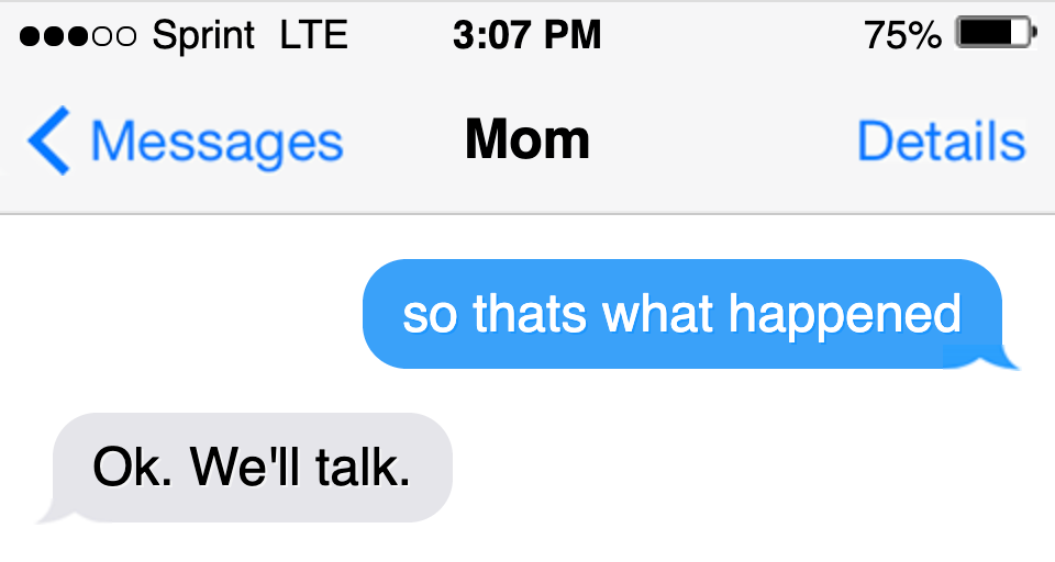
Fig 1
How does this (Fig 1) message exchange read to you? How do you read the response? Mom feels assertive and definitive. The periods evoke full stops in a short sentence. This might be an exercise of self control - trying not to immediately react to a larger situation. It matters that we’re reading text messages. Many of the overtones of Mom‘s statements come from common understandings of messaging (timed arrival, division of writing between messages).1. Short messages with full stops might mean anger, withholding or judgment. The medium does not have a lot of obvious latitude for expression. It’s an open question if Mom wants us to read those emotions, or any emotion, into this short message.
So much of our own reading of the exchange rests in the readers personal experience of how people express themselves in text messages. We know that whatever is being discussed is just above what we can see, available to both participants but not to us. Contextually, this exchange is obviously incomplete. The evidence that there is more information available isn’t in these two short written statements. It’s based on the general presentation of text messages. What if this same conversation was rendered a different way? Fig 2 has the same exchange in the style of a screenplay.
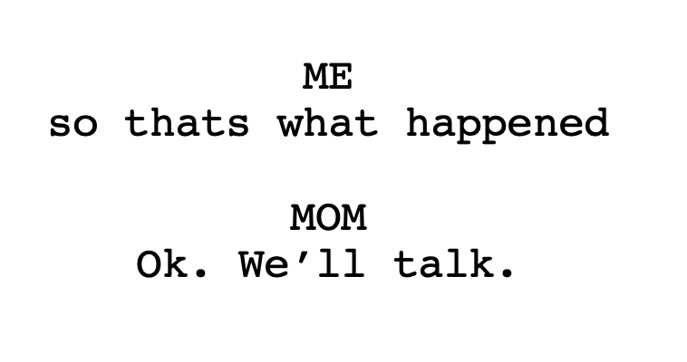
Fig 2
This exchange looks different! It doesn’t just look different: the difference in looks suggests different meanings. Even though the writing hasn’t changed at all, the 🅣🅔🅧🅣 has. The skeptical might suggest that the differences in interpretation come down to genre of text. But this is hardly an objection. Genre is everywhere. Every time we identify a social situation by looking at how people are standing or acting, we are making a genre judgment. We can tell someone is giving a talk because one person is sitting and talking and the others are sitting quietly and listening.2 Like everything else, to understand a written work and its meaning (🅣🅔🅧🅣) requires that we properly identify its genre. This demands a visual assessment of how the writing was presented.
If we change the writing a little we find another layer of visual information.
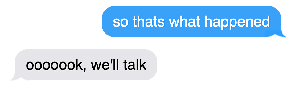
Fig 3
Are “ooooook” and “Ok” same word? You won’t find the former version in any dictionary. This is not a situation where repeating letters changes the dictionary definition (as in ‘lose’ and ‘loose’). It’s one where adding letters changes the sense of affect that wraps the linguistic portion of the message. It changes the 🅣🅔🅧🅣 but not the ‘text.’ The affect of what we say is as important, if not more important, than the words we chose. Emphasizing the first syllable in “ok” can be playful. It can express exasperation or exhaustion. It can communicate skepticism. When we speak, these ideas are communicated with tone and body language, but when we write we have fewer options for expressivity. Books must be printed from a (decreasingly) fixed set of characters, so we use text’s version of body language: departures from what the writer (and hopefully the reader) understand as the standards of ‘proper’ writing.
Like the spoken work, the difference between these two visual renderings exists, to a great deal, outside of written language as such. They manipulate their visual character to invoke a shared understanding of spoken language that accompanies it.
🅣🅔🅧🅣
The central fiction of written material is that it un-complicatedly links a thought to a word through the written page. It is not true that when a word is written it is simply the word. It is not a transparent representation of a linguistic idea. This is obvious when one stops to consider it. It is just as impossible to separate the written word from visual and cultural affect as it is to separate the spoken word from its embodied and affective qualities. The letters on a page need to be seen, their cultural and visual character assessed, in order for the writing to become the pure 🅣🅔🅧🅣 that exists in the mind. Once writing becomes 🅣🅔🅧🅣 we can see that different books really contain the same thing, even if they look totally different.
This insight doesn’t damage the written word at all. It opens writing up to new forms of understanding.
A Social Image
Before analyzing the how visual qualities of writing creates 🅣🅔🅧🅣, we must first consider the troublingly similar situation of the presentation of writing. This, too, is visual, but it acts on another layer. Changing the visual presentation of writing will change how the writing is read. This has both semiotic and functional elements.
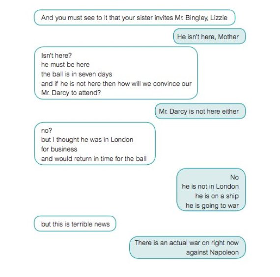
Text Messages between Characters in Pride and Prejudice (Fig 4)
Text messages are always carried on between yourself and one or more others. The other(s) are always on the left side, you are always on the right. In conversations where there is more than two speakers, each speaker’s messages will often have a different color. The work of identifying the speaker that novels do in writing is implied by a label at the top of buffer of text messages. Nothing in the format names the speaker of the messages on the right. The authorship is implied by the structure. A glance at a text message exchange will fill in the details in the 🅣🅔🅧🅣 that exists in the mind of the viewer.
These qualities are largely functional. They take advantage of the fact that text exchanges are always between “you” and some number of others to efficiently transmit information. If the same exchange was described in a script (as Fig 2) then it would need more explicit labeling to be sensible. But adding that to text messages would make them less functional. There are qualities (affordances) of the format that correspond to the demands of the format.
There are also semiotic qualities of the form. Certain kinds of exchanges happen over text messages and so the use of the form communicates how the exchange should be read. We expect informal conversations, not tax documents. Direct experience of text messages is essential to understanding the experiential qualities of the form. As much as one can explain “what it is like” to send or receive text messages, those descriptions will always use other experiences as reference.3 I could say that texting is like exchanging short letters…but of course, in important ways, it is not. The semiotic quality of format always comes back to our ability to recognize experiential qualities that someone is trying to signal. The functional aspects of the format help new and experienced users alike, but only experienced users can properly “see” the semiotics.
When Fig 4 imagines characters exchanging text messages, it imagines them speaking in ways particular to text messaging. This exchange does not appear in the book. But we are not yet talking directly about writing-as-image. For Fig 4 to make sense, the viewer must know what a text messages is, they must understand that these sentences are to be read in the context of a text message exchange. The format of a text message exchange is a visual container that communicates context. Its value comes in its ability to communicate genre. This makes the presentation format difficult to use as a mode of expression, except insofar as the mode of expression involves playing with the genre itself. Fig 4 only makes sense to an audience who has read Pride and Prejudice and is familiar with text messaging. It’s becomes interesting when the reader reflects on how they express themselves differently in the genre of text messages v.s. in speech.
The visual character of writing has can only be understood only within these genres of presentation (or presentation genre). To see how this is the case, try to imagine writing outside of a presentation genre. Handwritten scrawl, letters cut out and pasted together (a’la ransom notes), and street art are all presentation genres. As when people create a new genre of presentation (“the email”, “the snap”, “the text message”) part of that creation is an act of separating this new genre from the existing presentation genres. Like modern photography, these presentation genres are a structural part of social exchange. They allow us to represent our writings in immediately accessible genre containers and build social and affective understand with each other.4
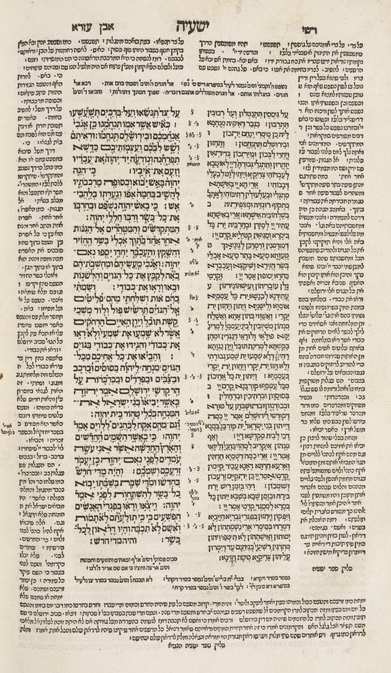
The TaNaKh With Commentary (🖼5)
Once the presentation genre is established, then the visual work of writing itself can begin. 🖼5 is a page from a 1524 edition of the Tanakh5. The central columns are the scripture itself, but the surrounding columns of writing are commentaries on the scripture.6 The spatial relationships between the different compositions are not an accident. Placing the actual scripture at the center of the page and the commentaries around it reflect the power relationship between the writings. Each page centers around the scripture - it’s why the reader and the Rabbis who wrote the commentary are here. But it would be wrong to say that the relationship is one way. The commentaries selected for this text are two of many commentaries and presenting them in this way, physically supporting a sacred scripture, elevates these commentaries over others.
Here we begin to see writing-as-image. This book is more than the sum of its parts. It constructs a different 🅣🅔🅧🅣 in the mind than reading the Tanakh on its own with the two commentaries on their own. Looking at a page of this copy of the Tanakh means needing to also see the commentaries sharing space with the holy scripture. It also means seeing how the explanations and interpretations appear to wrap and support the scripture - performing the same role for the reader as the Rabbi does for the faithful. They open up the scripture and suggest insights into the scripture. It suggests that one not need understand the holy scripture alone, that reading interpretations is good and right and helpful. It says all this by simply arranging the written works in relation to one another.
It’s important to note that this effect is created solely through the arrangement of the works. The fonts used for the scripture and the commentaries are the same.7 This is, in its own right, another visual message. In the same way that presenting these very different works together, using the same font to render them suggests they exist (in some sense) on the same level.
The way writing is arranged on a page is one level of visuality, but there is another level of visual quality on the level of individual characters. Writing arrangement is closely related and dependent on the presentation genre. If 🖼5 were to lose its presentation genre of “Tanakh,”” all the work the geometry of the written works is doing would also be lost. Many arrangements are impossible within a particular presentation genre. It’s hard to imagine constructing a text message version of the Tanakh with commentary. Which “side” is the commentary on? Which side is the Tanakh? The balanced structural arrangement in 🖼5 that suggests the commentaries are co-equal would be impossible.
Below the level of how different sections of writing are arranged are, of course, the characters themselves. Character sets have deep cultural and temporal resonance that ultimately flow from their qualities as images. Any reader who was alive during the beginning of the 21st century would remember the rise of 🅴🅼🅾🅹🅸🆂. Some people feel like emojis aren’t “really” writing, but I claim it’s the opposite: all characters are images first. 🅴🅼🅾🅹🅸 are just more obvious about it.
🅴🅼🅾🅹🅸
As opposed to traditional writing, where each letter (or word for pictographic languages) is an image that represents a language-idea, 🅴🅼🅾🅹🅸 are images that represent a thing or an idea. 🅴🅼🅾🅹🅸 admit that it’s appropriate to mix writing with images (because writing has always been a series of images). Each 🅴🅼🅾🅹🅸 has a written description that’s selected and voted on by the Unicode Consortium. Then individual 🅴🅼🅾🅹🅸 providers produce their own version of each 🅴🅼🅾🅹🅸. In this process, cultural biases that are so effectively hidden by idea of a non-visual writing system come forward - like when Apple chose to represent the 💃(“Dancer”) 🅴🅼🅾🅹🅸 as a female flamenco dancer.8
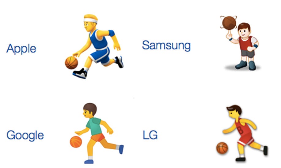
🖼"Person Bouncing Ball”
The rise in prominence of the 🅴🅼🅾🅹🅸🆂 reflects the demands of a society that increasingly uses text-based communication as a substitute for (as opposed to as a supplement of) in-person communication. With the presentation genre of a written work already used to stabilize the understanding of how one should read the work, 🅴🅼🅾🅹🅸 expand the power of written images9. That one 🅴🅼🅾🅹🅸 might be seen many different ways by people using different devices belies the differential reaction to all visual text. We live in an age where the exact presentation format of any of writing is uncertain and, as we will see, even though we can’t be sure what an 🅴🅼🅾🅹🅸 will look like for a particular viewer, they are also a more direct way of visual representation.
✊⏰
The written word enjoys an unusually strong claim to be representing language. Photographs and paintings have struggled for years with the question of representation. Though a photograph and a painting are objects in themselves, they also are pictures of things.10 The connection between the objects that we can see and touch in the world and the objects that appear in images feels especially strong in these mediums where both painting and photographs are related to objects that have existed.11 Photographs are the product of recording reflected light and while paintings don’t need to depict real objects, people expect them to link back to the real world - to be a painting “of” something. Barthes described the difficulty of seeing a photo over the thing the photo is “of”12: the object and the photo are entangled together and difficult to separate. The subject of a famous photo will always be associated with that photo: seen in a particular way and from a particular angle. The photo, which could be imagined as being the insight which gives us access to the subject, is also seen as hopelessly dependent on the subject. This two-way-relationship between the depicted and the depicting comes to be important in the visual character of writing.
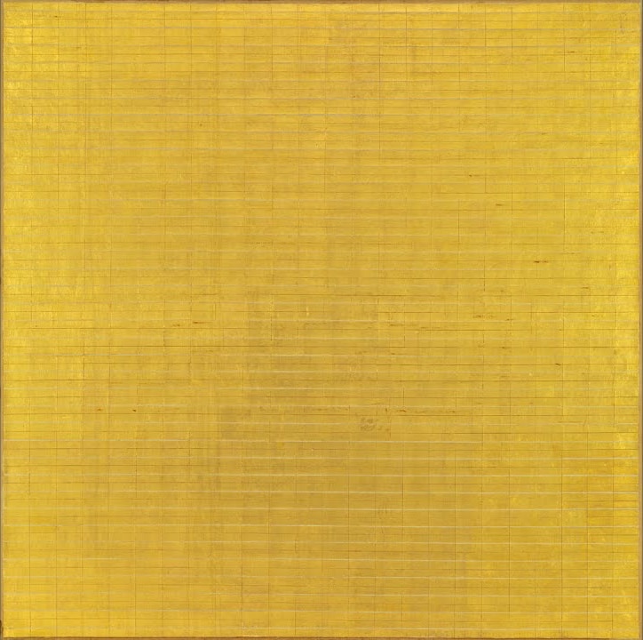
“Friendship” by Agnes Martin
When a young girl visiting Agnes Martin’s home picked a rose, Martin asked her if the rose was beautiful. The girl said it was. Martin hid the rose behind her back and asked if the rose was still beautiful. Her visitor replied yes again. “You see,” Martin said, “beauty is in your mind, not in the rose."13 The beauty is 🅣🅔🅧🅣, not writing.
Painting of the abstract is powerful because we know there are things that do not have a fixed visual quality. Nevertheless, they are often things we can see. “Friendship” is not, of course, a picture of friendship exactly. Instead, it is a picture that might hope to evoke in the viewer a similar feeling as the viewer feels when they experience friendship. Depictions of letters and paintings of feelings have something in common: they are both pictures of things that don’t have physical form. When we draw or sculpt or carve a letter, we are depicting something, like friendship, that doesn’t have a physical form. Instead it is a social and cultural agreement to depict an aspect of language (a language-idea) in a recognizable and reproducible way.
So the two-way-relationship that exists between letter and language-idea has a difference balance of power. The language-idea has an unfixed form, impacted by accent, culture, experience, mood and many other things. Each person’s experience of a language-idea is deeply personal. It’s why we feel an immediate kinship if someone says (or writes) something that suggests they share a cultural background (it’s also why that feeling is reliable). Culture is one of those things that impacts our lives in many ways but is too large to see fully. It’s part of a group of “hyperobjects” - things that are too large for any human to fully see and understand, but which we know through their effects.14 Global warming is a hyperobject and culture is another. The language-idea that a letter represents exists within a hyperobject of culture and the two-way-relationship between it and the letter is experienced affectively by each reader. The letter is still a visual object and the visual qualities of it are important (as we will see), but its cultural resonance is central to its ability to represent.
This places writing in a strange representational position. Much like presentation genre it could be stuck between conforming to expectations or risking incomprehensible illegibility. But relationships to cultural hyperobjects are more closely related to time than anything else. When he spoke about the qualities of photography, Barthes highlighted how each photograph was inescapably taken at a time that it would carry with it. He did not mean that it carried the date as such, but that the character and situation of a time in history is unavoidably depicted in images taken at that moment in history. The cultural character of writing is similar.
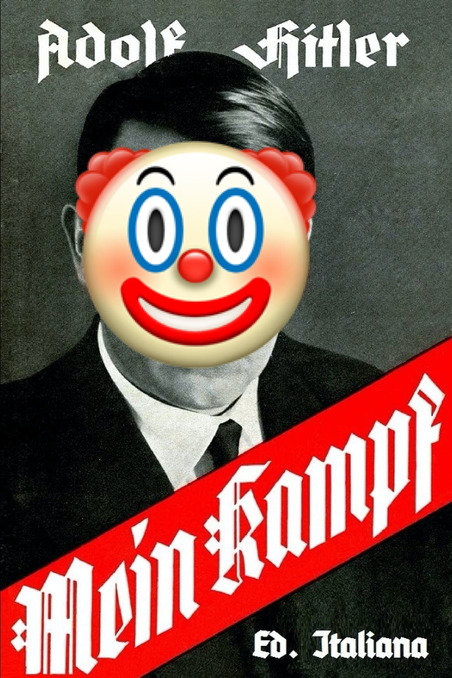
🖼🤡
The script used in 🖼🤡 is called “Fraktur” (𝔉𝔯𝔞𝔨𝔱𝔲𝔯)15. It was the official font of the Nazis movement in 1930’s Germany. The font was not created by the Nazis - it was based on a lettering technique created to deal with the challenges of reliably hand-writing (repeatedly painting images) letters by scribes. It became heavily associated with “Germanness” before the Nazis movement and was adopted by the movement in their faux promotion of everything “German.” Today the font is irrevocably associated with fascism and racism.16
Even if one accepts the idea that particular characters (or particular fonts) can connect a piece of writing to a particular cultural hyperobject, there’s a question of specificity. Are fonts specific? Is it 𝔉𝔯𝔞𝔨𝔱𝔲𝔯-𝔦𝔫-𝔦𝔱𝔰𝔢𝔩𝔣 that represents fascism, or is it how 𝔉𝔯𝔞𝔨𝔱𝔲𝔯 looks17? If writing is not read as an image first, but is directly accessed as a symbol, than visual confusion shouldn’t be a concern. The human “reader” will see the symbol of the text: be it the fascistic 𝔉𝔯𝔞𝔨𝔱𝔲𝔯 or the benign (modern) Blackletter font.
@DVBAG was zur Hölle soll das pic.twitter.com/be7QJlwb1f
— 🌱 Hero in Training 🛡️ (@Barldarian) December 16, 2019
When Peter Dörfell saw this sign (declaring the driver to be “German”) on a German Bus it did not matter that it used the Blackletter font and not 𝔉𝔯𝔞𝔨𝔱𝔲𝔯. This detail did not fool him. It is still a reference to fascism and racism.18 The two modern seers in this situation, Peter and the bus driver, share the judgment that this font looks enough like 𝔉𝔯𝔞𝔨𝔱𝔲𝔯 that it may as well be 𝔉𝔯𝔞𝔨𝔱𝔲𝔯. The fascistic overtones exist in the 🅣🅔🅧🅣 in both their minds. What the font represents depends on the cultural hyperobject it’s connected to. People from 1930’s might see things differently, but modern people are able to see past the specific choice of 𝔉𝔯𝔞𝔨𝔱𝔲𝔯 or Blackletter to the intended 🅣🅔🅧🅣.
The difference in the world were 𝔉𝔯𝔞𝔨𝔱𝔲𝔯 was the official font of a fascist government and the world where an incompetent fascist picks the wrong text to signal his racism brings us back to a quality of images: they have both a visual and cultural character. As I said earlier, 𝔉𝔯𝔞𝔨𝔱𝔲𝔯 characters link back to a particular cultural hyperobject, but not all seers will perceive that link. The passing of time can reveal the surreal qualities of images that didn’t initially seem surreal. They do this not because the images were surreal at their creation, but because surreality emerges out of the combination of how we imagine something should be represented and how we see it represented before us.19
🖼✊⏰
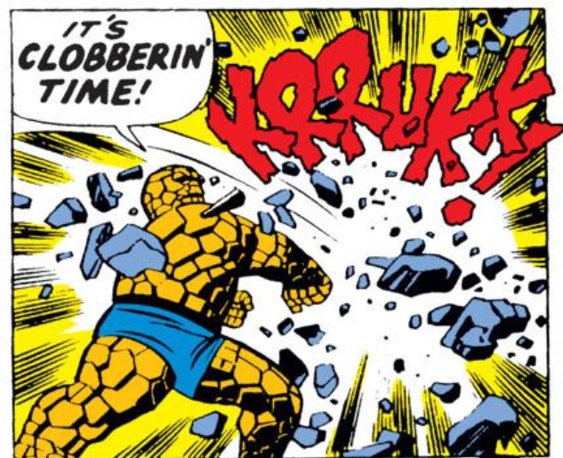
The Thing (shown in 🖼✊⏰) is a character from the Fantastic Four series of comic books. His slogan is “It’s Clobberin’ Time.” His super power is being made out of rock. He’s an unserious character who’s dispenses clobberin’ and one-liners in equal measure. So when @brandon_couture_ uses 𝔉𝔯𝔞𝔨𝔱𝔲𝔯 to render his catchphrase, the result is surreal.
In this example it’s not surreal because time has passed since @brandon_couture_ created his image, but because we are re-introducing the history of the font (and the calligraphic style from which it descends). Instead of time revealing surreality though its passage, it reveals surreality by re-introducing a context around 𝔉𝔯𝔞𝔨𝔱𝔲𝔯 that @brandon_couture_ was almost certainly not focusing on when they produced their art.
Crucially, the production of surreality does not depend on intent or semiotics. When Sontag pointed out that Ghitta Carell’s portraits of the Mussolini era were surreal, that surreality was revealed to Sontag because from difference in Sontag’s cultural frame and Carell’s. It was how that difference revealed the absurdity of wealth and pretense in the brief, vainglorious Italian regime and the temporary and illusory nature of the airs of the regime. Carell does not need to have been “in on it.” It just is.
In the same way, the surreality of @brandon_couture_‘s image exists as 🅣🅔🅧🅣 in the minds of those who are primed to read it. The image is a product of our times, where displaying ones art on Instagram is common and fascism can seem far away. There’s no reason to believe the intent behind the image was surreal in character. The surreality exists in the image. Specifically in the surreal image of the writing itself.
When is a 🚬 Just a 🚬?
Barthes introduced two terms to explain his personal experience experience of photos. Barthes insists these terms and experiences are personal to him, but I also find they are personal to me. He uses the term studium to refer to a kind of average quality shared between images of a type.20 When you recognize that a photo belongs to a genre (a selfie is a “sorority selfie” maybe), you are recognizing its studium. Second, there’s the punctum: a detail that leaps out of the image that strikes an individual viewer in a particular way. The punctum cannot be intentionally inserted into the image to provoke interest and is individual to each viewer. Your punctum and my punctum may be very different. An image might have many punctum for different viewers, but its studium would be fixed.
These concepts apply to writing just as well as they do to images. A good font is all studium and no punctum - all average, with nothing standing out to the viewer at all. This is how writing is thought to work: a smooth medium for the transmission of linguistic ideas. That looking at writing leads un-complicatedly to the 🅣🅔🅧🅣 behind the writing. Of course, you literally see the writing on the page, but its character shouldn’t intrude into your perception. Though, that begs the question: what would text with a punctum even look like?
🖼 ℭ𝔬𝔪𝔦𝔠 𝔖𝔞𝔫𝔰
Comic Sans (🖼 𝕮𝖔𝖒𝖎𝖈 𝕾𝖆𝖓𝖘) is a famously hated font. There’s a long parade of articles explaining why it is bad, inappropriate, etc. Whatever the specifics, the authors attacking the font are revealing that, for them, Comic Sans contains a punctum. Just like Barthes’ photographic punctum, this one is deeply personal and becomes more powerful when the creator of the image doesn’t intend to create a punctum. When their intended 🅣🅔🅧🅣 omits the cultural baggage of Comic Sans. An author who uses Comic Sans to provoking the hate they’re already aware of inevitably leaves wink towards the target audience. The situations where the use of Comic Sans are actually infuriating to the viewer would never attract parodies intended to provoke. The same instinct that tells the viewer Comic Sans is wrong would prevent them from using Comic Sans parodies. If the ‘wink’ of the parody is effectively read, the reader reacts to the Comic Sans image as a work of parody and the font loses its punctum. If the ‘wink’ isn’t read, then the punctum remains precisely because the author has failed to produce a parody. The punctum remains because it’s unintended.
It’s important to draw a distinction between the cultural association of 𝔉𝔯𝔞𝔨𝔱𝔲𝔯 and the punctum of Comic Sans. 𝔉𝔯𝔞𝔨𝔱𝔲𝔯 is fascistic because it was used by the Nazi party, not because its visual character is inherently fascistic. That cultural connection is established through the act of seeing 𝔉𝔯𝔞𝔨𝔱𝔲𝔯. The use of 𝔉𝔯𝔞𝔨𝔱𝔲𝔯 is an intentional shorthand for fascism and so it cannot be be a punctum21. Comic Sans has understood qualities (being unserious, lightness, silliness) that come from shared cultural context (like 𝔉𝔯𝔞𝔨𝔱𝔲𝔯). Comic Sans’ punctum comes from the person applying it being unaware of those cultural associations.
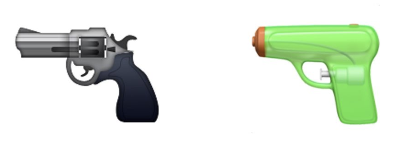
🖼🔫
When Unicode originally added the 🔫 🅴🅼🅾🅹🅸 in 2011, the description was simply “pistol” and the sample image provided by the Unicode organization was to a pistol that fires bullets (a firearm).22 In all likelihood, when you see this essay, you will see a 🔫 that looks more like a squirt pistol. 🖼🔫 shows the old and new Apple character for 🔫.
When 🔫 was added, it was added to the Unicode section for representing “tools."23 Arguably, a firearm pistol makes more sense as a “tool” than a squirt pistol. Hard to imagine hunting for food with a squirt pistol. The change in what kind of pistol 🔫 represents was in response to the punctum of the old 🔫. The punctum of 🔫 is a threat, but as before it’s a punctum because the threat isn’t intended. Those seeking to threaten violence don’t need 🔫 to display a firearm pistol, they can use 🔪 or 🗡 or ✊ or old fashioned written language to make their threat. They can craft a message to create the desired threatening 🅣🅔🅧🅣 in the mind of their reader. The problem comes back to unexpected readings, or a punctum. The danger was threatening someone when you didn’t mean to.
Where traditional fonts link an image to a language-idea, 🅴🅼🅾🅹🅸 link an image to a thing-idea. Like the language-idea a thing-idea is influenced by social experience of the idea, but it’s also influenced by the qualities of the thing the character seeks to represent. Unlike the language-idea, which doesn’t exist outside of the shared mental 🅣🅔🅧🅣 of language, object 🅴🅼🅾🅹🅸🆂 exist outside of language and our minds. When Apple wanted to avoid a punctum they were restricted in which objects they could depict as 🔫 by the physical existence of “pistol.”
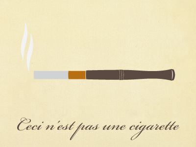
🚬
So does this bring us back to where we were with representation in photographs and paintings? With the represented object and the image irreversibly entangled? Not quite. This is more like the work of Agnes Marten. 🅴🅼🅾🅹🅸 are not images of things, they are images of the ideas of things. They are images of how things exist in our minds. This is reflected in the change in the 🔫 emoji: it’s better that 🅴🅼🅾🅹🅸 avoid specificity. The punctum of 🔫 came from depicting too much of a specific kind of pistol. Because the new 🔫 is less commonly seen, it also more cleanly stands in for a diversity of pistols. We see, in the un-seriousness of a squirt pistol, the potential to represent all pistols. The images’ obscurity lends itself to its association with a greater range of things. This freedom of association shows that even the specific image of an 🅴🅼🅾🅹🅸 can represent a general studium.
So what difference does it make to type “cigarette” or “🚬”? Maybe a better question is what’s the difference between “𝔠𝔦𝔤𝔞𝔯𝔢𝔱𝔱𝔢” and “🚬”? As I’ve tried to argue, the question is not between “text” and image, but between different kinds of visual communication. After all, “cigarette” links its letters to a language-idea, but then that language-idea is linked to a thing-idea. A 🚬. The 🚬 is more direct. It skips a link between the “page” (web or otherwise) and the 🅣🅔🅧🅣 that we carry around with us once we’ve read something.
🔜🔜🔜🔜🅣🅔🅧🅣
Writing is relentlessly, unavoidably visual. That this truth is rarely considered is a testament to the strength of presentation-genre and the work of maintaining the studium of fonts and handwriting styles. But we are now in an age of an explosion of flexibility in writing. This document is published in a medium that allows the reader to set their own font, use their own set of 🅴🅼🅾🅹🅸🆂. This will increasingly be way people access written works of all kinds. An explosion in diversity of the visual character of writing. An explosion in the diversity of paths taken to arrive at the mental 🅣🅔🅧🅣.
This essay lays out some of the visual tools writers can use to shape the impact of their texts. Be aware that presentation can evoke (or suppress) surreality. Consider using an 🅴🅼🅾🅹🅸 to be more direct (even though you aren’t quite sure what image your reader may see). When the Tanakh in 🖼5 was written, new fonts were hugely expensive. We now live in a golden age of visual writing and we should embrace it.
Bibliography
Barthes, Roland. Camera Lucida: Reflections on Photography. Macmillan, 1981.
Bomberg, Daniel. Sha’ar HaShem Ha-Hadash (Second Rabbinic Bible). 1524. Paper. http://www.sothebys.com/content/dam/stb/lots/N09/N09589/550N09589_98MFG.jpg.
Bowker, Geoffrey C., and Susan Leigh Star. “Invisible Mediators of Action: Classification and the Ubiquity of Standards.” Mind, Culture, and Activity 7, no. 1-2 (May 1, 2000): 147–63.
Burge, Jeremy. “Apple And The Gun Emoji.” Emojipedia. Emojipedia, August 4, 2016. https://blog.emojipedia.org/apple-and-the-gun-emoji/.
Caldwell, Annie. “The White Space in Poetry.” Medium. Lit Up, December 18, 2019. https://medium.com/lit-up/the-white-space-in-poetry-41619b22594a.
Dörfell, Peter. “@DVBAG Was Zur Hölle Soll Das.” Twitter, December 16, 2019. https://twitter.com/Barldarian/status/1206496305394200576.
Green, John. “Works of Art by Agnes Martin and Hiroyuki Doi | The Anthropocene Reviewed | WNYC Studios.” WNYC Studios, January 30, 2020. https://www.wnycstudios.org/podcasts/anthropocene-reviewed/episodes/anthropocene-reviewed-works-art-agnes-martin-and-hiroyuki-doi.
Hern, Alex. “Why Are Samsung’s Emojis Different from Everyone Else?” The Guardian, September 6, 2017. http://www.theguardian.com/technology/2017/sep/06/why-are-samsung-emojis-different-from-everyone-else.
Hitler, Adolf. Mein Kampf. Ed. Italiana. Blurb, Incorporated, 2018.
Jurgenson, Nathan. The Social Photo: On Photography and Social Media. Verso Books, 2019.
Mars, Roman. “Fraktur.” 99% Invisible, February 18, 2020. https://99percentinvisible.org/episode/fraktur/.
Mauss, Marcel. “Techniques of the Body.” Economy and Society 2, no. 1 (February 1, 1973): 70–88.
Morton, Timothy. Hyperobjects: Philosophy and Ecology after the End of the World. U of Minnesota Press, 2013.
The Museum of Modern Art. “Agnes Martin. Friendship. 1963 | MoMA.” The Museum of Modern Art. Accessed March 17, 2020. https://www.moma.org/collection/works/79842.
O’Connor, Paul. “Panel Gallery: It’s Clobberin’ Time!” Longbox Graveyard, January 29, 2014. https://longboxgraveyard.com/2014/01/29/panel-gallery-its-clobberin-time/.
Ortberg, Mallory. Texts from Jane Eyre: And Other Conversations with Your Favorite Literary Characters. Henry Holt and Company, 2014.
Payne, Thomas. Why Do You Hate Me. Digital. Caliber, July 31, 2017. https://miro.medium.com/max/5000/1*qSvJPETfsKNnsipAjy01zA.png.
Prokhorov, Nikita. Ceci N’est Pas Une Cigarette. Digital. https://www.nikitaprokhorov.com/, August 2, 2013. https://dribbble.com/shots/1180911-Ceci-n-est-pas-une-cigarette.
Sontag, Susan. On Photography. Macmillan, 2001.
Sothebys. “Religion ||| Sotheby’s n09589lot98mf6en.” Sotheby’s, December 15, 2016. http://www.sothebys.com/en/auctions/ecatalogue/lot.198.html/2016/important-judaica-n09589.
Unicode, Inc. “Submitting Emoji Proposals.” Unicode, August 20, 2019. https://unicode.org/emoji/proposals.html.
Unicode Inc. “Miscellaneous Symbols and Pictographs.” Unicode Inc., October 11, 2010. https://www.unicode.org/charts/PDF/Unicode-6.0/U60-1F300.pdf.
Zylinska, Joanna. Nonhuman Photography. MIT Press, 2017.
Image Credits
| Caption | Source |
|---|---|
| Fig 1 | Drexler, Daniel |
| Fig 2 | Drexler, Daniel |
| Fig 3 | Drexler, Daniel |
| Fig 4 | Ortberg, Mallory. |
| The TaNaKh With Commentary (🖼5) | Bomberg, Daniel. |
| 🖼"Person Bouncing Ball” | Hern, Alex. |
| “Friendship” by Agnes Martin | The Museum of Modern Art. |
| 🖼🤡 | Hitler, Adolf. (Cover) |
| 🖼✊⏰ | O’Connor, Paul. |
| 🖼ℭ𝔬𝔪𝔦𝔠 𝔖𝔞𝔫𝔰 | Payne, Thomas. |
| 🖼🔫 | Burge, Jeremy. |
| 🚬 | Prokhorov, Nikita. |
Tools used
- https://www.tablesgenerator.com/markdown_tables: Used to format tables in markdown
- https://ifaketextmessage.com: Used to generate the fake text exchanges
- https://gohugo.io: Static webpage generator used to make this entry
- https://yaytext.com/fraktur/: For generating fraktur texts
-
Text messages are a useful side-example of how silly it is to imagine that writing is not visual first. After they are finished, phones display text exchanges as one continuous buffer of messages, sometimes with breaks between days or pauses in message exchanges. This form, however, does not tell the full story of the experience of texting.
Reading the history of a text message exchange (which might be months or years) to produce our understanding of the exchanges (our 🅣🅔🅧🅣) completely ignores the uneven temporal nature of the conversation. Messages can come in bursts or emerge slowly. The presentation of the messages (length, rapidity, use of abbreviations) are both influenced by the stylistic preferences of the sender, the receiver (display style, notification settings) and the circumstances someone is sending the text under. All of these qualities impact how a message is read in the moment the receiver reads it (possibly, but not certainly, the moment of its receipt).
Text exchanges, like speech, cannot be reduced to their transcript. The experience of being in a text exchange, with messages visually intruding into the use of your phone, is entirely visual. Our experience of what text messages mean (their 🅣🅔🅧🅣) is deeply influenced by how text messages are displayed to us. ↩︎
-
Mauss, Marcel. ↩︎
-
Bowker, Geoffrey C., and Susan Leigh Star. ↩︎
-
Jurgenson, Nathan. pp. 8 ↩︎
-
The holy scripture of the Jewish faith. The name “TaNaKh” comes from the individual texts it contains: the Torah, the Nevi’im and the Ketuvim. Also called the “Hebrew Bible.” ↩︎
-
Sothebys. ↩︎
-
This has one big caveat: I can’t read Hebrew! I don’t know if there are details that elude me because I’m looking at the image of a 16th century text in a language I don’t read. I’m confident that this is a genre of presentation, but it’s not one I’m socialized to understand.
So if there are differences between the letters used in the Tanakh and used in the commentaries (aside from the difference in font size), this point is wrong. However, I hope that either way the point comes through: there is image of the arrangement of text and there is image in each character. This essay largely focuses on the image qualities of each character. ↩︎
-
Hern, Alex; Unicode, Inc. “Submitting Emoji Proposals.” ↩︎
-
You might also see a “⍰” or a “☐” or some other indicator that the 🅴🅼🅾🅹🅸 has failed to load. ↩︎
-
Sontag, Susan. pp. 113-114; Zylinska, Joanna. pp. 24-25 ↩︎
-
Barthes, Roland. pp. 76 ↩︎
-
Barthes, Roland. pp. 6 ↩︎
-
Green, John. ↩︎
-
Morton, Timothy. ↩︎
-
As luck would have it, 𝔉𝔯𝔞𝔨𝔱𝔲𝔯 is included in the Unicode standard (apparently for use as mathematical constants). I discovered this partway through writing this essay, but it’s very useful. ↩︎
-
Mars, Roman. ↩︎
-
There is an experiential character that suggests this is a meaningless distinction. The act of identifying something as being inside or outside of a category (𝔉𝔯𝔞𝔨𝔱𝔲𝔯) is itself an act of seeing. It is visual in nature and it might be argued that if someone sees non-𝔉𝔯𝔞𝔨𝔱𝔲𝔯 text as ‘𝔉𝔯𝔞𝔨𝔱𝔲𝔯’ than it comes to the same. But that doesn’t seem like a necessary short cut to me. ↩︎
-
Mars, Roman. ↩︎
-
Sontag, Susan. pp. 45 ↩︎
-
Barthes, Roland. pp. 26 ↩︎
-
It could be said that the Surreality of ℑ𝔱'𝔰 ℭ𝔩𝔬𝔟𝔟𝔢𝔯𝔦𝔫’ 𝔗𝔦𝔪𝔢 it itself a kind of punctum, but I think at that point we might really be counting the number of angels on the head of a pin. ↩︎
-
Unicode Inc. “Miscellaneous Symbols and Pictographs.” ↩︎
-
Ibid. ↩︎


